Picking a near-black paint color for the ultimate man cave
A showdown of dark paint colors! We tested Iron Ore, Ebony Keys, and Iron Mountain for Christian's man cave. It was a tough call, but we have a winner.

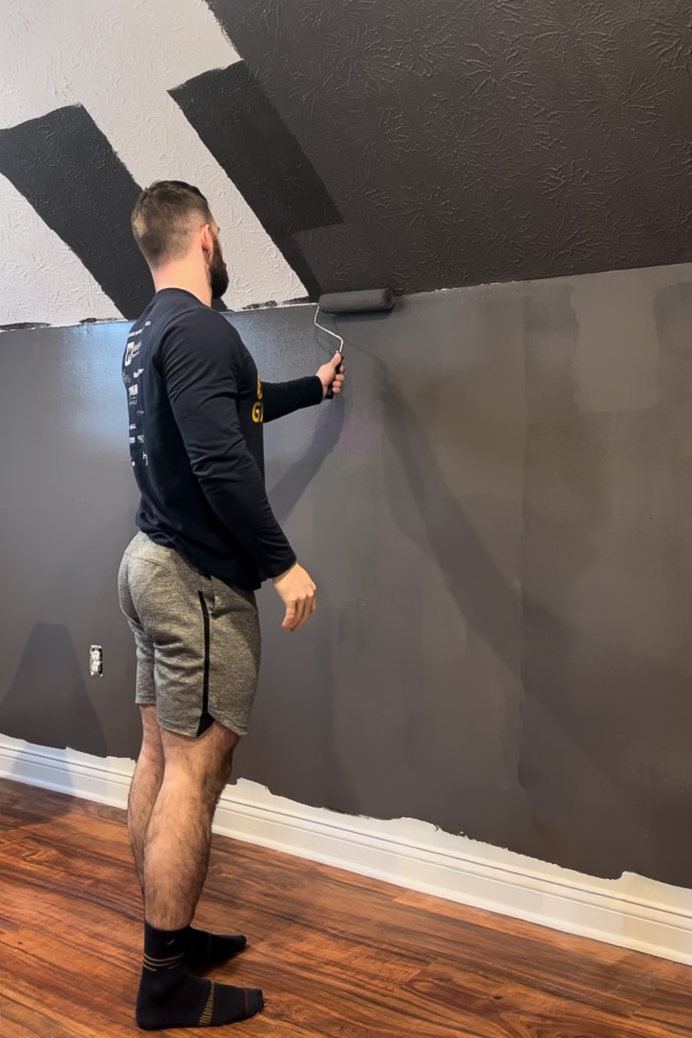
We've finally shifted the renovation focus upstairs! Yes, the downstairs isn't quite finished yet (we'll get there, I promise), but it's time Christian got started on his own sanctuary: the Ultimate Man Cave!
And let me tell you, this room is going to be a complete departure from the rest of the house's style. I've been trying my absolute hardest to keep my design opinions to myself—and believe me, the struggle has been real! The toughest part? Watching him pick out paint colors. But it's his space, his rules, and he has a serious vision. Picture this: a sleek F1 showroom, paying homage to the F1 memorabilia. Then seamlessly blended with a high-tech racing sim rig and gaming vibe, and ambient LED lighting that instantly changes the mood. But it's not all adrenaline. The space will be anchored by a lounge area. This is where the comfort comes in: we're talking deep, comfy leather chairs. This entire corner is dedicated to kicking back, relaxing, grabbing a drink off the bar cart, and most importantly, making it the perfect spot to gather and watch all the F1 races.
Christian is dead set on going DARK with the paint for his office, which gives me slight flashbacks. I had a similar vision (though not quite as dramatic) for a moody vibe in my own office. If you followed that saga, you know how that ended. I chose a darker paint color, immediately regretted it, and ended up just painting the room the same off-white color as the rest of the house. Fingers crossed, Christian's bold vision works out better than mine did.
However, he does want an accent wall using acoustic slat wood panels to contrast with the paint color, so we gathered 3 paint options to test which complement the slat wood panels. Iron Mountain 2134-30, Ebony Keys 8006-2G, and Iron Ore SW 7069. These swatches nearly look the same; however, you can tell their differences once you test them on a wall. I've given a quick overview and my thoughts on each based on how they showed their characteristics in our home.
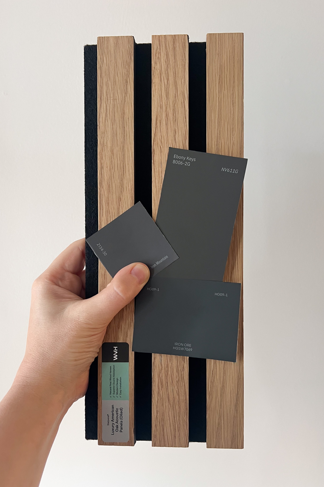
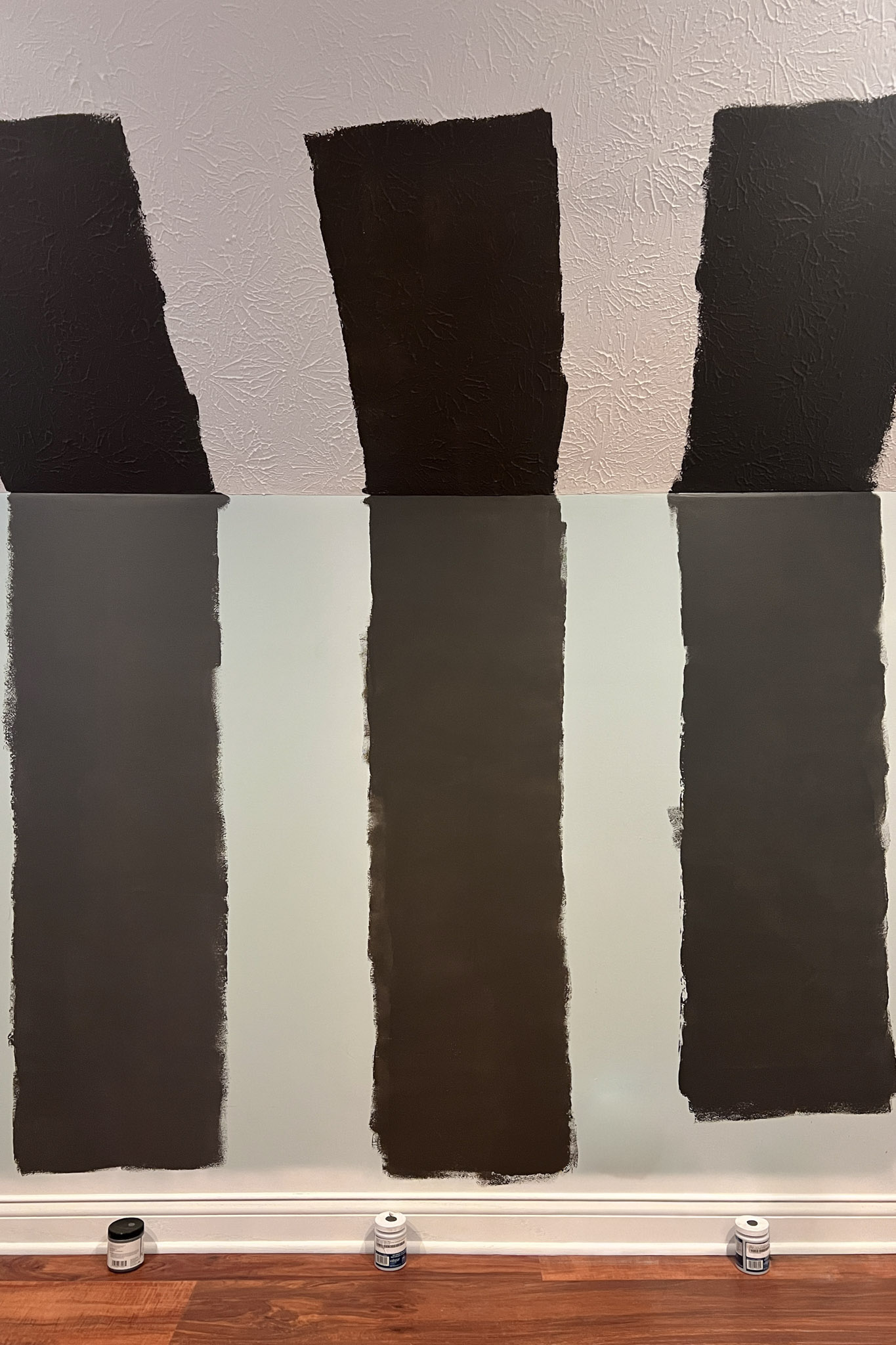
The following reviews are in order from right to left, as seen in the above photo of sampled paint colors.
Iron Ore SW 7069
Iron Ore is a truly elegant, deeply mysterious charcoal by Sherwin Williams that serves as the perfect, sophisticated alternative to a stark, true black. It delivers a modern, moody, and architectural look.
- Color and undertone: Iron Ore is classified as a near-black hue. It is noticeably darker than a typical deep gray but avoids the harshness of an absolute black, giving it a softer appearance. The most common perception is a subtle blue-gray undertone. This cool base prevents the color from feeling dull and lends it that crisp, sophisticated character.
- Appearance in light: Depending on the light, some may detect a slight greenish/yellowish pull. This is typically very subtle and appears in certain lighting conditions or when contrasted with other grays. We did not observe this in our space.
Iron Ore provides that intense, architectural depth you are looking for without the strong, chocolate-brown warmth. While Iron Ore is stunning, our final impression was that it may lean slightly too dark, hovering right at the edge of pure black. Ultimately, it leaned a little more gray than the happy medium of a tapuey dark gray that we were looking for, but it remains a highly recommended deep charcoal for trim, accents, and cabinetry.
Ebony Keys 8006-2G
Ebony Keys is a deeply saturated, near-black paint color from the Valspar line. This color is often described as the perfect blend between a deep, inky black and a soft, dark mocha. It achieves a rich, sophisticated, and moody atmosphere that is both dramatic and inherently grounded.
- Color and undertone: Although categorized as a black with a cool undertone, its true complexity lies in its subtle brown and gray composition. Despite the official cool classification, we found that the brown and mocha influences add a strong visual warmth to the color. This effect prevents the color from appearing harsh or aggressively stark like a true charcoal or pure black, instead creating an inviting, velvety depth.
- Appearance in light: As with all complex colors, Ebony Keys' appearance is highly dependent on light. In well-lit spaces, the warm brown undertones are pulled forward, causing the color to read as a deep espresso or a rich dark chocolate. In low-dim light areas, the color deepens significantly, approaching a very soft black.
While the initial swatch seemed to reveal a slight gray cast, this undertone disappeared once the color was applied to the walls under our specific lighting conditions, highlighting the brown. Ultimately, while the mocha undertones were exactly what was needed to complement the wood slat panels, the color leaned too distinctly brown on the walls for Christian's desired look. We determined it was closer to a true dark brown than to the sophisticated, soft black Christian had hoped for.
Iron Mountain 2134-30
Iron Mountain is a refined deep charcoal gray from Benjamin Moore, often referred to as a "soft black." It is popular for its ability to create an atmosphere that is simultaneously cozy, intimate, and elegant.
- Color and undertone: The depth of Iron Mountain comes from its complex and shifting undertones, which are highly dependent on light. It features distinct brown undertones that anchor the color's warmth, making it feel cozy rather than cold. It does have subtle shifting hues of blue and violet. We definitely noted the violet undertones being more prominent in the paint swatch or when wet, but they softened as the paint dried.
- Appearance in light: It appears its darkest and leans more black with a hint of blue in shadowy/cool lighting. However, it will look its brightest and softest in bright/warm lighting, highlighting its warm brown undertones.
Iron Mountain was our winner. Its color complexity and sophisticated depth set it apart from the others. It struck the perfect balance between a deep charcoal gray and a soft, warm black. Its subtle brown undertones prevent it from appearing too harsh; however, it delivered the dark depth Christian desired without feeling flat or overwhelming. Its nuanced color, infused with subtle brown undertones, gives the room a uniquely rich and cozy feel.
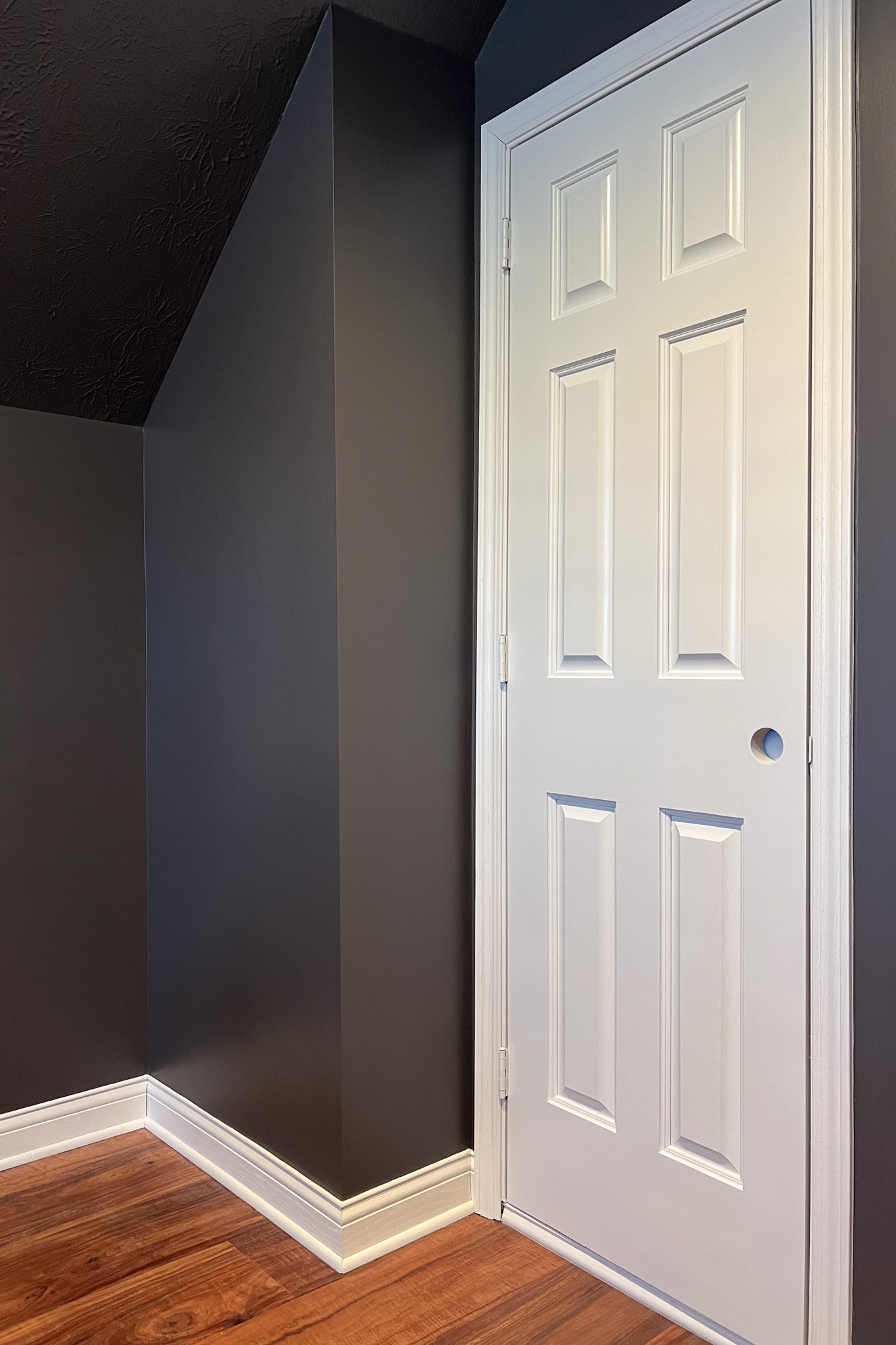
With the perfect backdrop set, Christian is shifting focus to the next stage of his ultimate man cave transformation. Next, he plans to install the acoustic slat wood panels as an accent wall to create texture and contrast. Following that, the atmosphere will come to life with ambient LED lighting, setting the mood for late-night gaming and F1 viewing parties.
Up next