My second attempt at the perfect office paint color
I tried to convince myself the initial color I choose would grow on me, but my indecisiveness never faded. So it was time to rethink everything.

While I loved the darker, moodier space, my initial paint choice just wasn't working for me. I initially painted it Antiquing JG-128 from Magnolia Home by Joanna Gaines, but it had too much of a purple undertone. I went back and forth with how I felt about it. I even lived with it for several months, hoping it would grow on me and the indecisiveness would go away, but it never did.


So, it was back to the drawing board. I was still considering another dark paint color, but honestly, I was a little over trying to get it just right. What if I ended up in the same spot, not liking the color again and having to repaint for a 3rd time. I've also realized it's a little more challenging to decorate with darker colors, so I decided to opt for something lighter. Yeah, I know I'm taking the easy way out here.
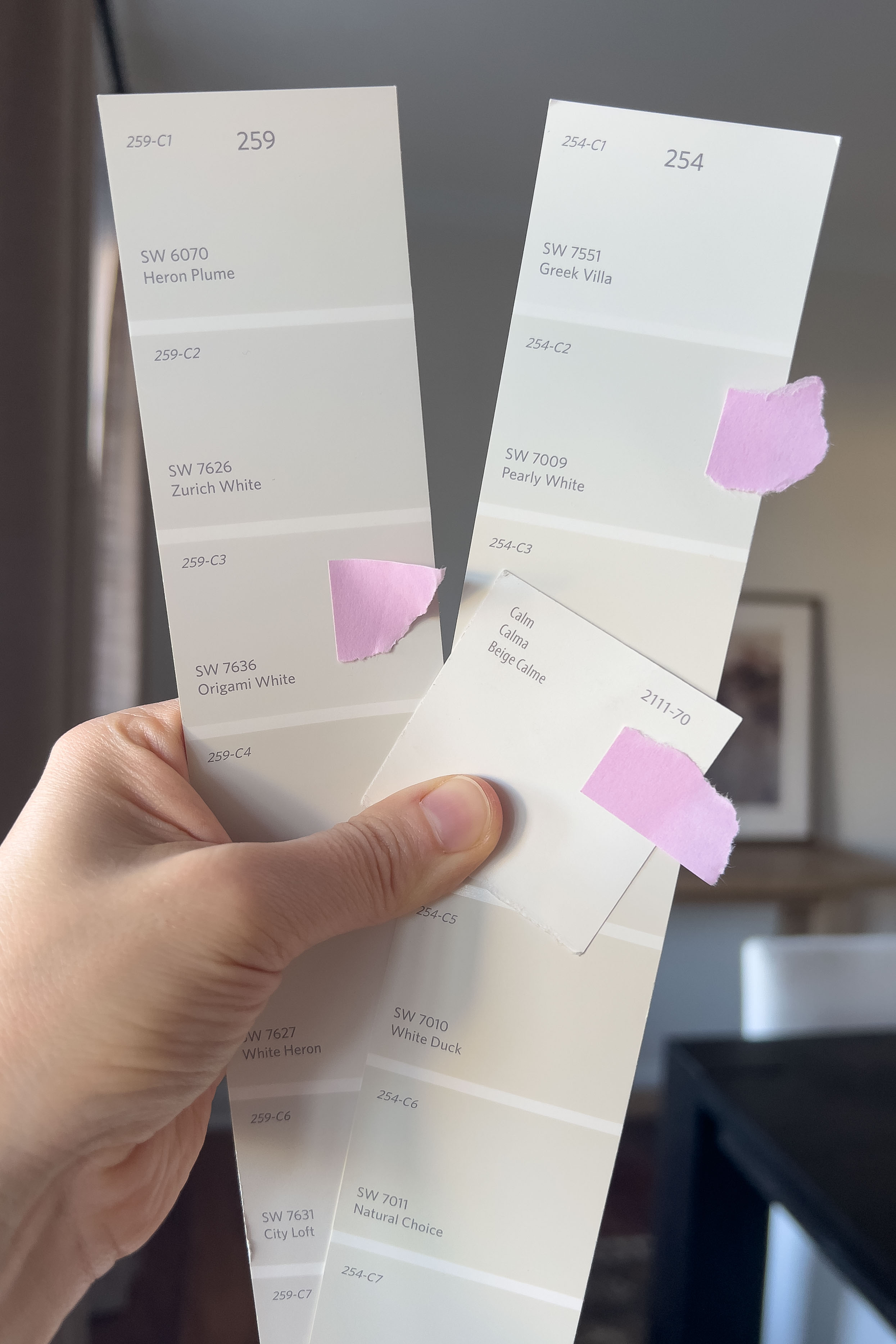
I decided to test two paint colors from Benjamin Moore: Ice Formations 973 and Swiss Coffee OC-45.

Ice Formations 973
Ice Formations is a gorgeous warm gray, truly a "greige" with a significant beige presence. We actually painted our home's exterior this color and absolutely love it. It's a showstopper. We frequently receive compliments on this color, which made me wonder how it would translate indoors. I figured it would be darker in color due to reduced natural light, creating a moody backdrop that was still light enough for easier decorating.
Despite having subtle green undertones, Ice Formations reads as very neutral. It's an incredibly calming color that creates a cozy ambiance. While it develops a soft moodiness in less direct light indoors, its appearance takes on a slightly "muddier" quality compared to its exterior vibrancy. However, it retains its organic feel and warmth, contributing to a distinctive earthy feel. This color balances gray and beige, creating a versatile foundation.

Swiss Coffee OC-45
Swiss Coffee has become a popular choice among popular designers, which naturally made me curious about it. This warm white paint is a creamy beige with subtle yellow undertones, which sets it apart from stark or cool whites. It's said that its warmth helps create a cozy and welcoming atmosphere in any room. With a light reflectance value (LRV) of around 82, Swiss Coffee reflects a significant amount of light, which actually makes it feel too bright in our home. However, it would be an excellent option for rooms that lack abundant natural light, as it prevents them from feeling dim or confined. Many consider it a classic off-white that offers timeless appeal and won't quickly go out of style.
While Swiss Coffee's warmth primarily stems from its yellow undertones, it definitely didn't appear overtly yellow on our walls. However, I believe the subtle yellow could become more noticeable in specific lighting conditions or when paired with stark white trim or cool colors. Some also observe very subtle green undertones, which add depth and help prevent this color from looking like a flat cream.

So, which color did I choose?
Neither! Ice Formations was too muddy, and Swiss Coffee was too light. More importantly, introducing a new off-white (like Swiss Coffee) would likely create inconsistencies throughout the house and spark an overwhelming urge to repaint the entire home in the same off-white shade -- not going to happen.
To maintain simplicity and cohesion, I decided to use Benjamin Moore's Calm OC-22, a color we already have ten gallons of and have used throughout the rest of the house. I know it works well in our home, and it saves me money by avoiding the need to buy more paint and the risk of potentially having to paint again. Consistency is usually key, and sometimes, the best choice is the one you've already made.


Up next