A mysterious portrait's second act
I found a stunning portrait at a vintage store and brought this somber piece back to life with a new custom frame.
I've always been drawn to original artwork. As a former painter, I have a deep appreciation for the craft and sentiment that goes into each piece. There's a different feeling you get from standing in front of an original painting versus a print—it's like you can feel the soul and the story within the peice.
For years, I've wanted to fill my home with unique, original pieces. But let's be real, art can be expensive. While I'll occasionally splurge on a piece I absolutely love that isn't ridiculously priced, I spend most of my time hunting for beautiful finds at vintage and antique stores.
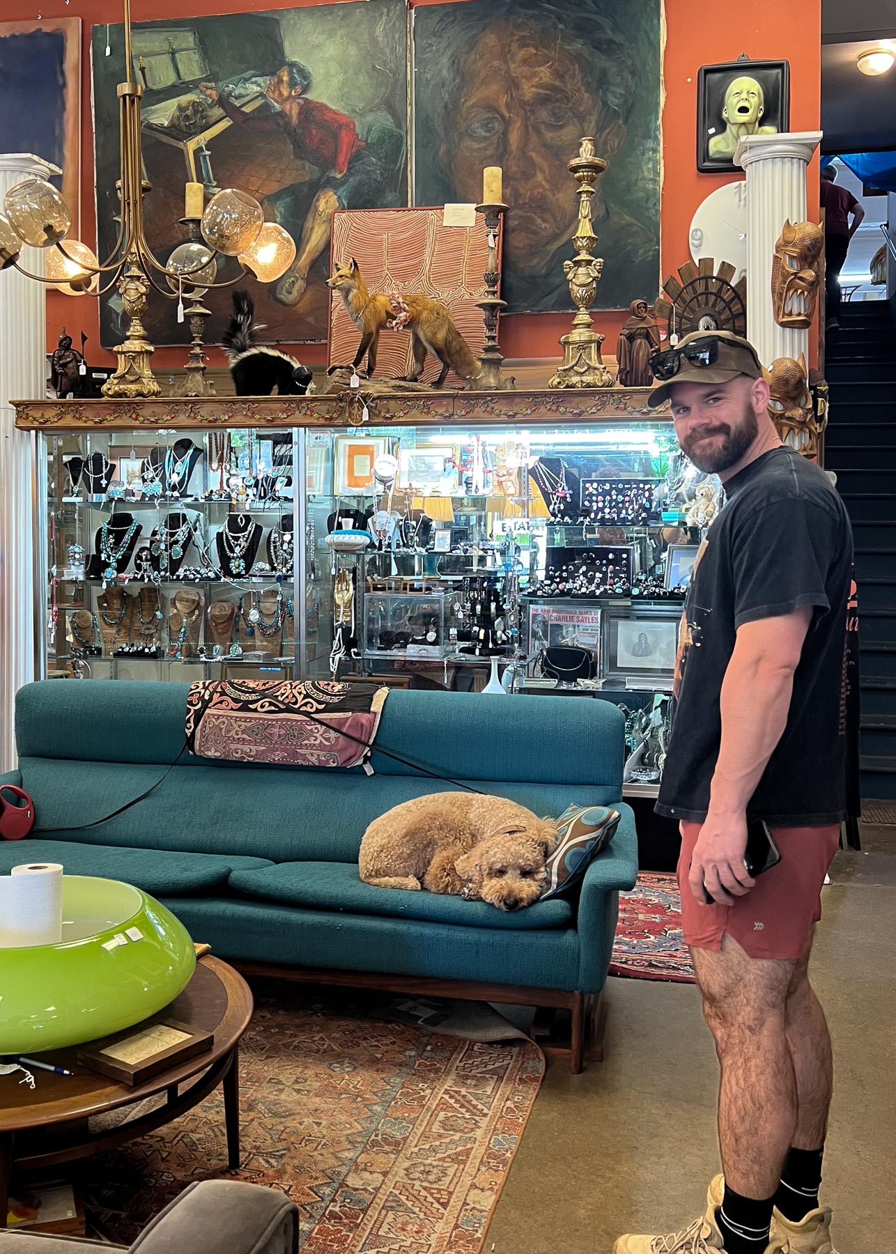
Recently, Christian and I went on a day trip to Bloomington, Indiana. We stumbled upon a fantastic spot called Jeff's Warehouse—Vintage for the Home. If you're in the Indianapolis area and love vintage decor, I highly recommend checking it out. Jeff has an incredible collection of unique art, sculptures, and furniture. Make sure to say hi to Cooper, the friendly store pup.
While browsing, I came across an impressionist painting of an older woman. Side note: Am I the only one who sees a woman? Everyone else who sees the painting thinks it's a man. There was no signature on the piece, so the artist remains a mystery, but I instantly fell in love with it. While some might find this painting a bit eerie, I'm drawn to its loose, expressive style, suggesting a sense of emotion. I love the visible brushstrokes, the warm reddish-brown earth tones, and the way the soft, muted blue-gray background contrasts with the warmth of the skin tones. I knew it would be perfect for the space above our bar cabinet in our breakfast nook, adding a much-needed pop of color. The only challenge was convincing Christian that this somber grandma belonged in our home. Luckily, he was on board without much persuasion lol.
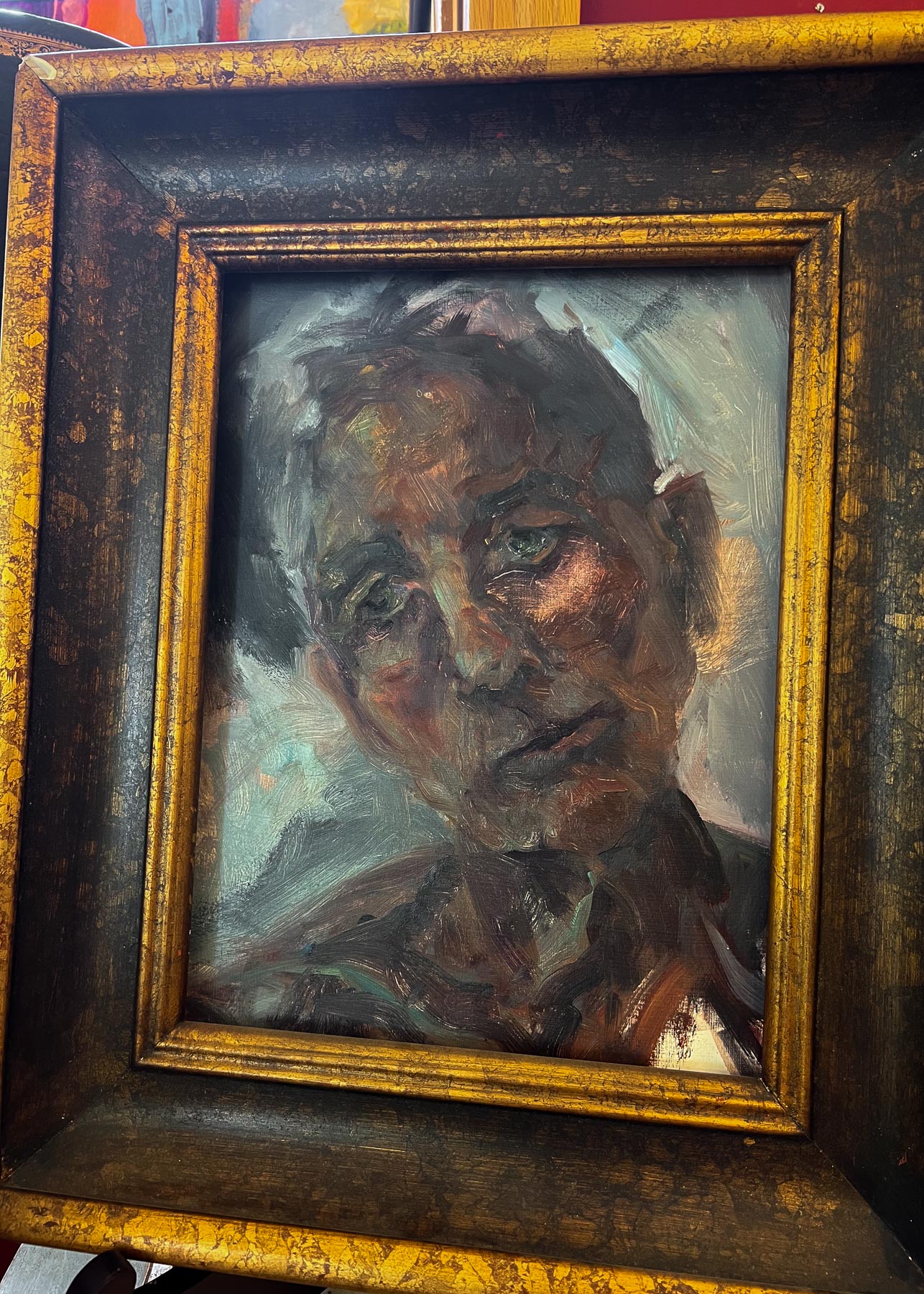
The painting's original frame was damaged, so I took it to Michaels to get it measured for a new custom frame. I spent an hour at Michaels, searching for the perfect combination of mat and frame. I wanted something that would honor its original style while also making the painting pop, ensuring she didn't blend in but instead stood out against the new frame and mat. I keep calling her "her," and if the artist ever reads this and wants to set me straight or reveal their identity, I'd love to know!
I chose a very soft, pale blue-green textured mat with a subtle shimmer. I'm not usually a fan of shimmer, but I liked how it looked on this particular mat finish. For the frame, I chose something brassy with some depth, similar to the original frame. However, I went with a more modern style frame that has a smoother texture and cleaner lines.
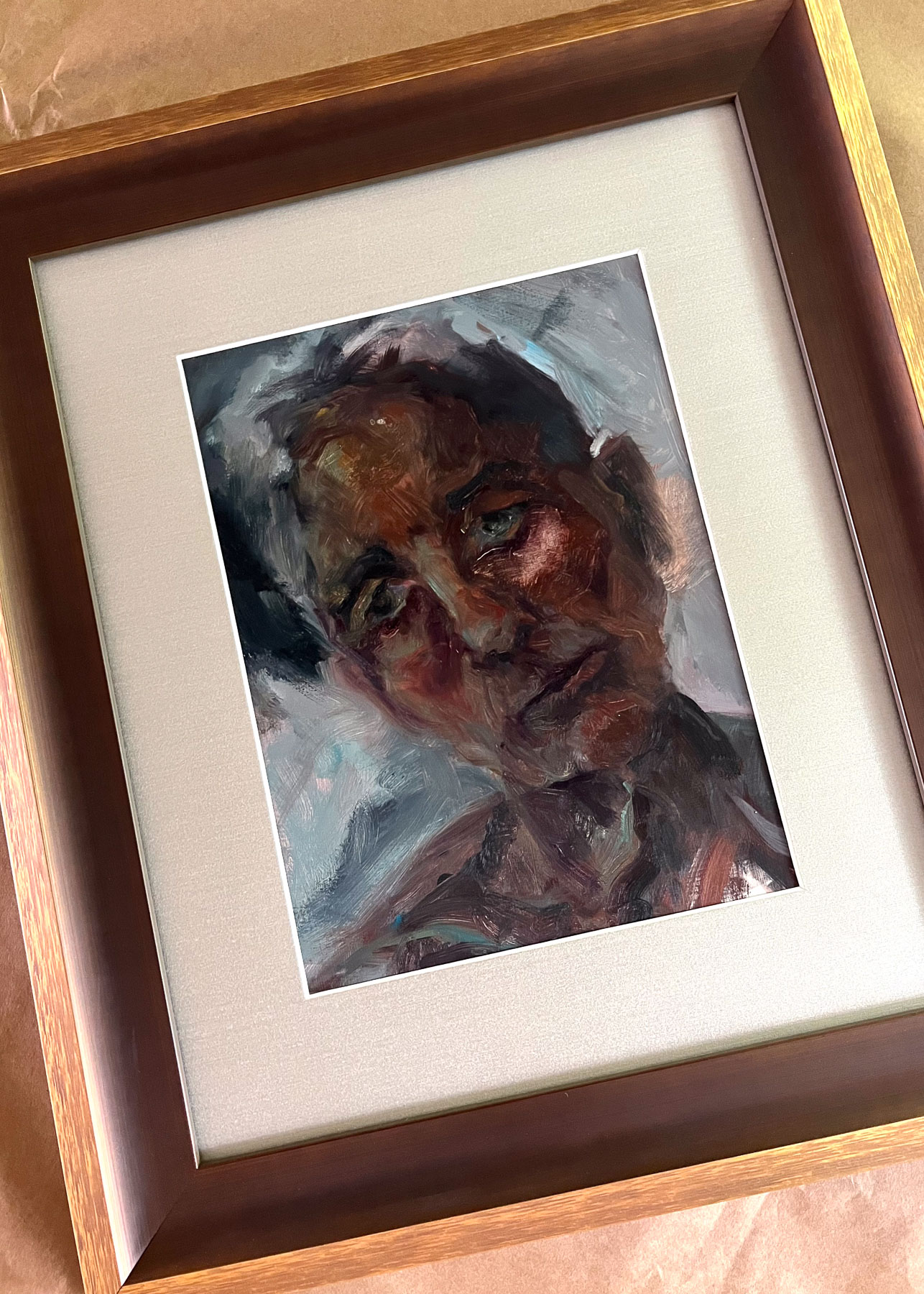
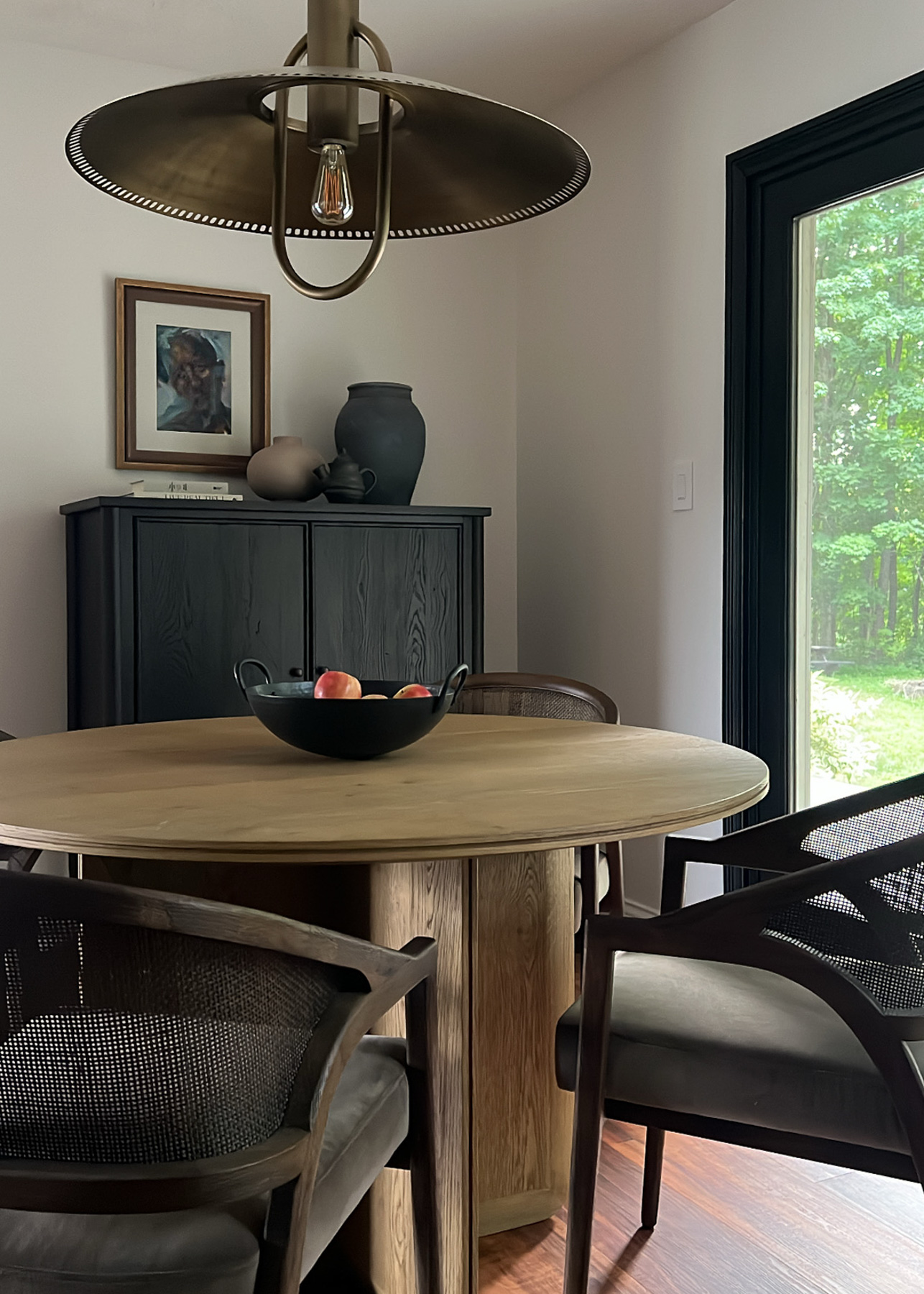
This was my first time getting something custom-framed, and while custom framing can be quite expensive, more expensive than the painting in this case, I'm so pleased with the result. The new mat and frame gave this piece new life, transforming it into a beautiful statement piece I get to enjoy every day.
Up next


