The total overhaul and final reveal of my home office
My office went from a '90s relic to my favorite room. This was a labor of love: sanding, drywall, and a paint saga. See the before-and-after.

My office has come a long way, and I’m excited to finally share the before-and-after photos of its transformation. This room, where I spend a significant chunk of my time, has become my favorite spot in the house. The journey here was definitely a labor of love, filled with lots of sanding, frustrating drywall patching, and a paint color saga.
Let’s go down memory lane and see where this story began.
The "before": a relic of the '90s
Like much of the house, this room was a time capsule of 1990s design choices. An era defined by clashing finishes and sometimes puzzeling color combinations.
The walls: They were a muddy beige with greenish-yellow undertones, casting a dull cast over the entire space.
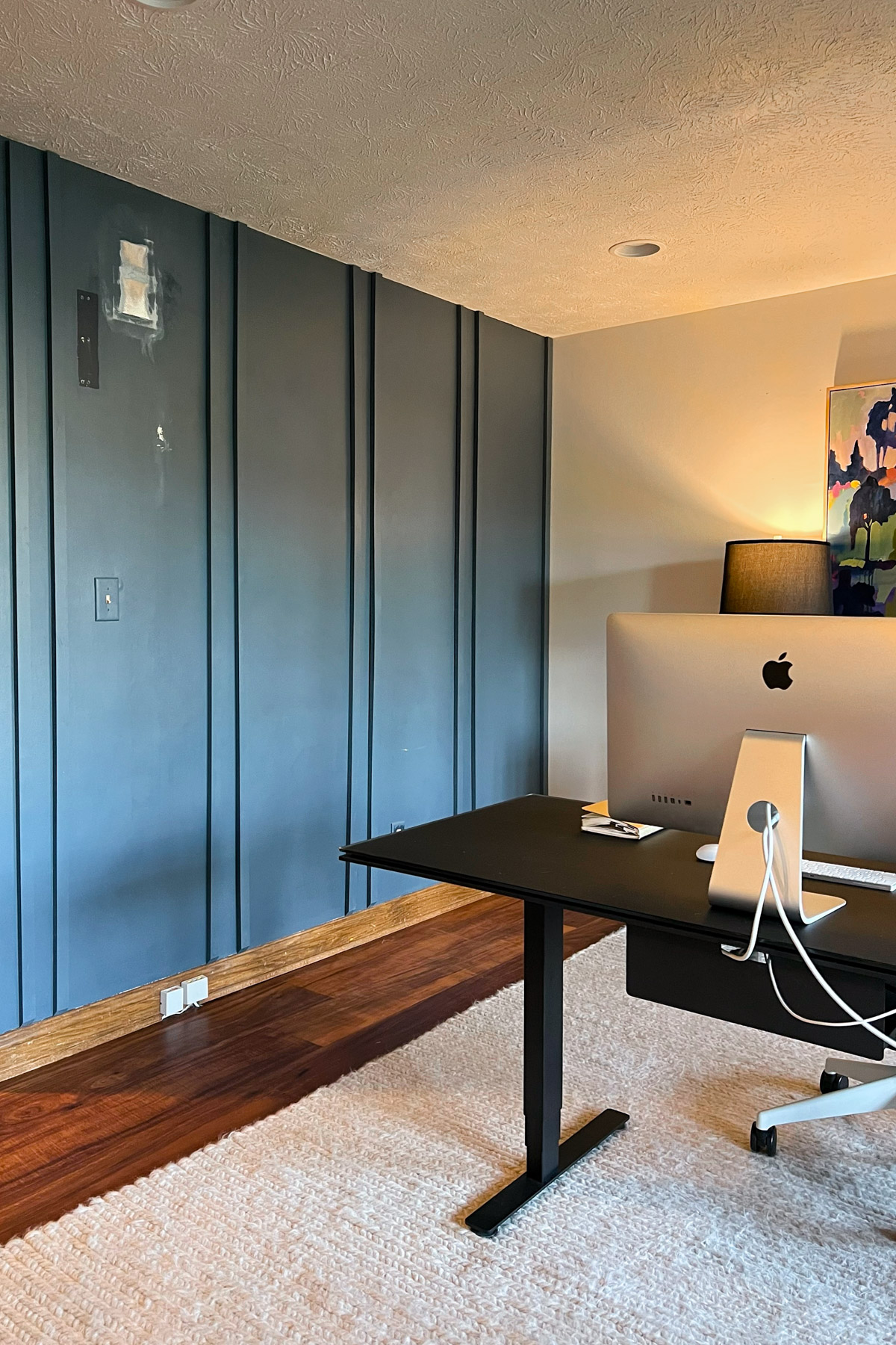
The accent wall: A navy accent wall with vertical wood molding (batten style) attempted to add depth but ended up creating a heavy, closed-in feeling.
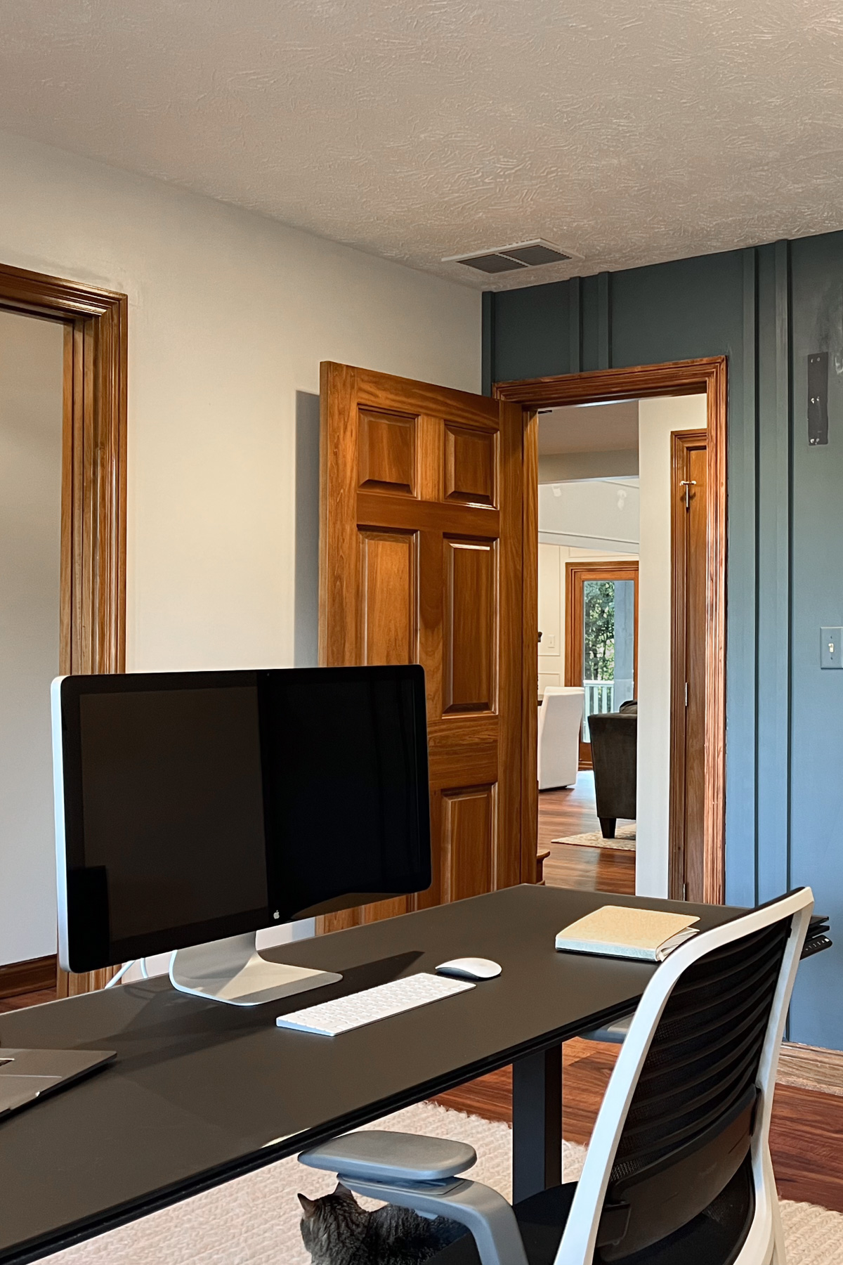
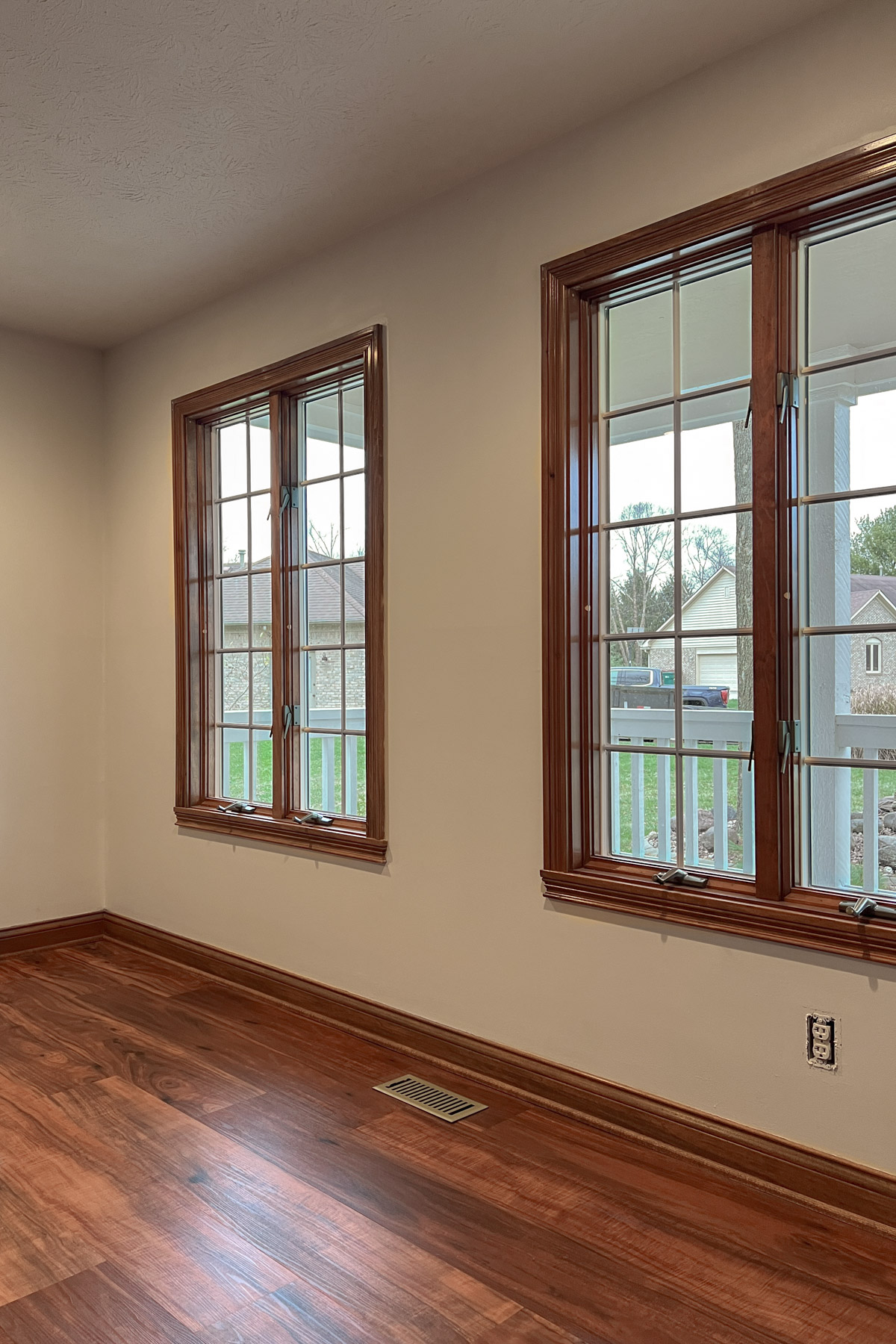
The wood war: The biggest ongoing challenge was the visual clash between the heavy, honey oak trim and doors and the warm, orange tones of the flooring. This clash of wood finishes left the room feeling not just dated but overpowering and disjointed.
The vision: a moody, collected office
From the start, I knew my office needed to be more than just a functional workspace; I wanted a creative sanctuary that deliberately broke away from the sterile, "bright and white" trend. My vision was to create a space layered with depth, soul, and a sense of history. A place where rich textures, deep colors, and natural materials would foster introspection and spark creativity. If you want to see the inspiration behind this look, check out my full mood board and paint selection process.
Color Palette: The foundation would center on deeply saturated earthy neutrals: dark browns, charcoal grays, muted taupes, and deep reddish browns, all of which ground the room and create a sense of warmth and permanence. Accents of aged bronze and subtle notes of dusty olive or deep navy would add depth and visual interest without overwhelming.
Materials and textures: I envisioned heavy, organic woods and rustic elements to suggest timelessness, balanced by plush upholstery in linen or wool for comfort and understated luxury.
Atmospheric lighting: Lighting is intentionally low-key and warm, using localized sources, stately table or floor lamps, and dimmer controls to fill the room with a gentle glow.
Collected decor: The goal was a layered, collected feel, featuring large shelves filled with books and meaningful objects, sculptural pieces, and layered textiles. The final space had to feel like a cozy, intellectual, and inspiring office designed for thoughtful work and creative exploration.
Phase 1: laying the foundation
Before we could decorate, we had to dismantle the '90s aesthetic, which is always a significant undertaking.
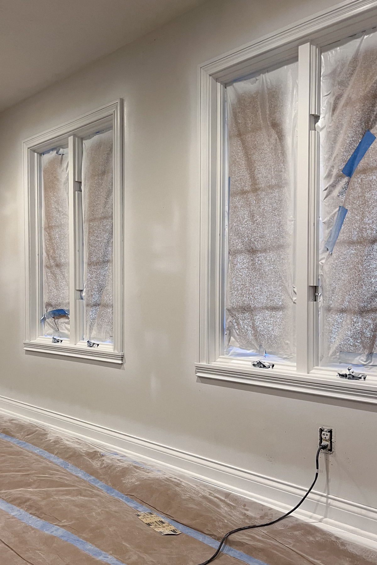
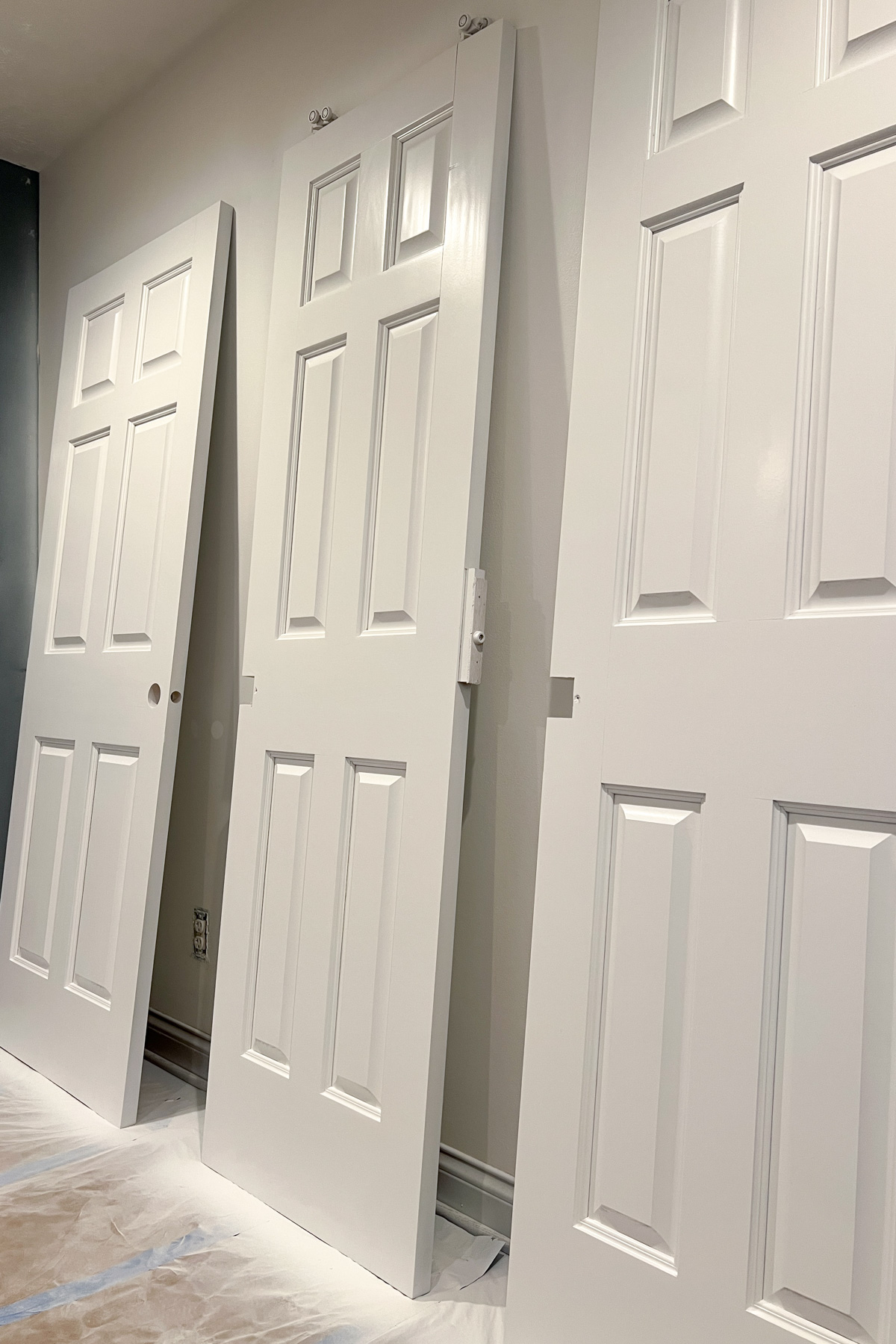
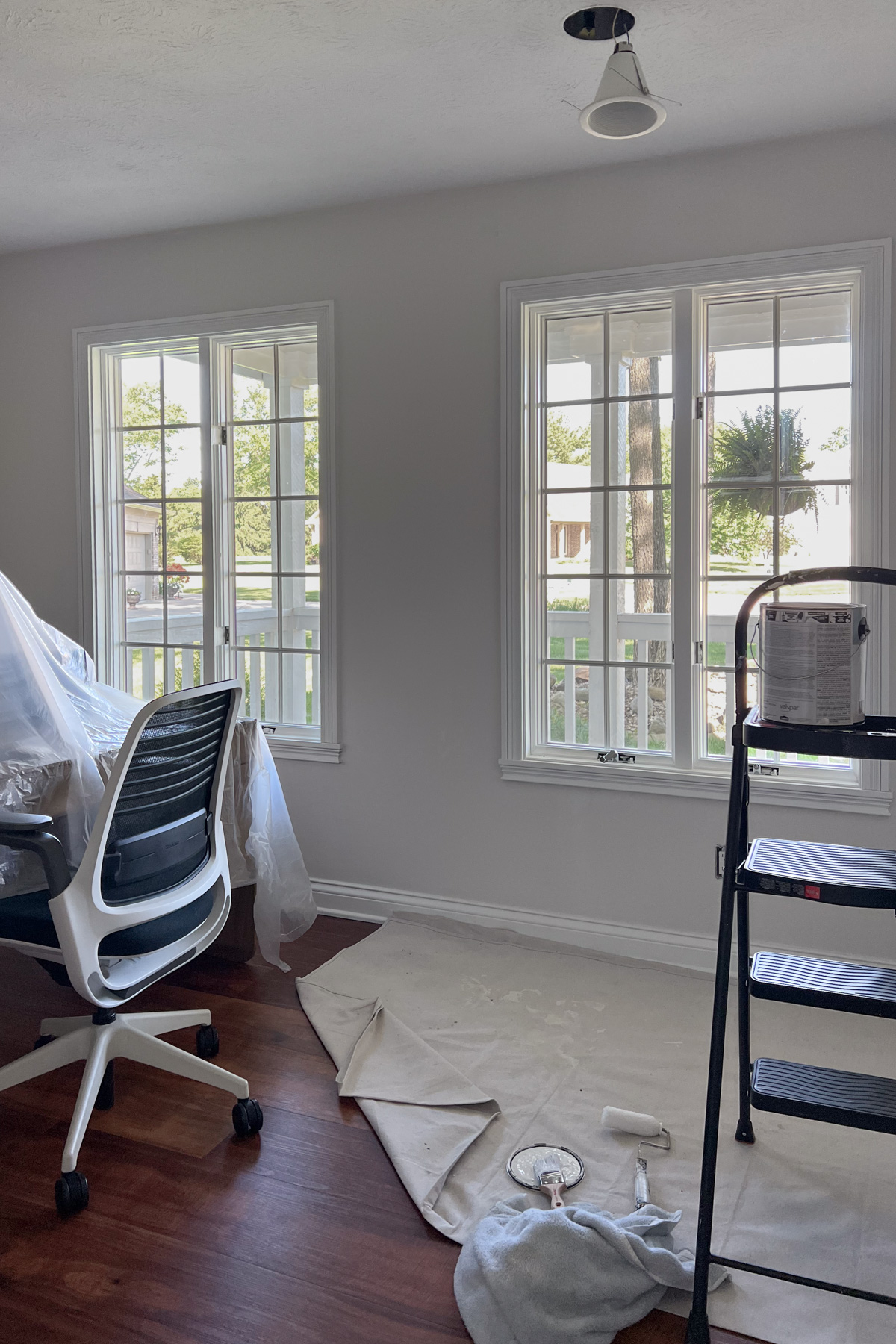
Our initial focus was on eliminating the "wood war" by spraying the trim and doors a crisp white. This involved weeks of careful preparation: filling gaps, tons of sanding, and applying multiple coats of paint. The meticulous effort was absolutely worth it, as the freshly painted trim and doors instantly elevated and modernized the entire space.
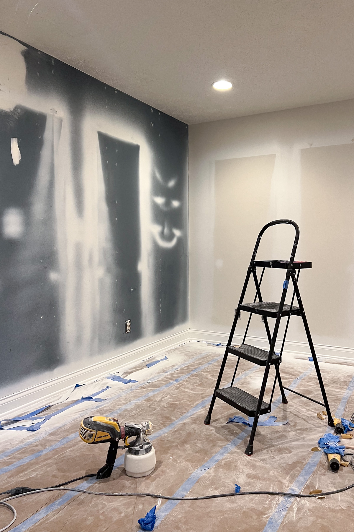
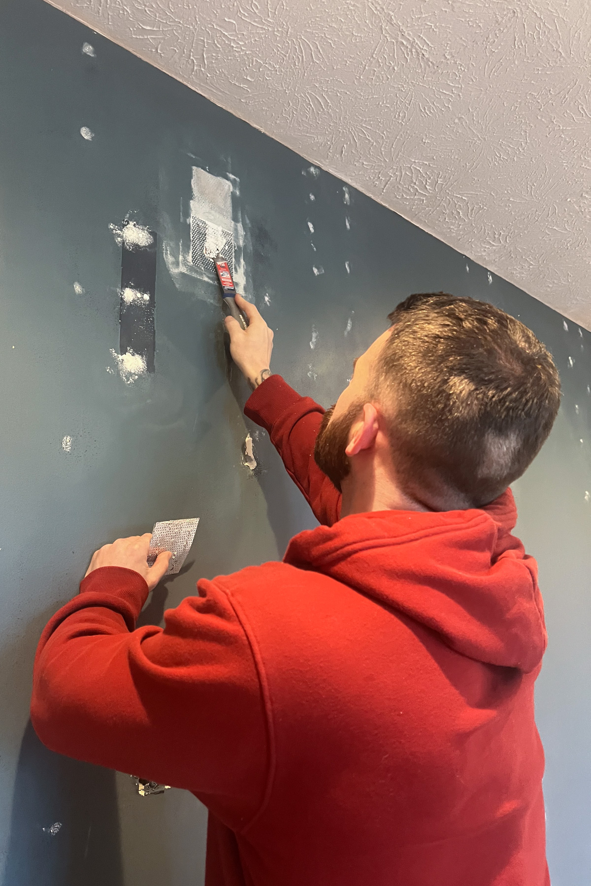
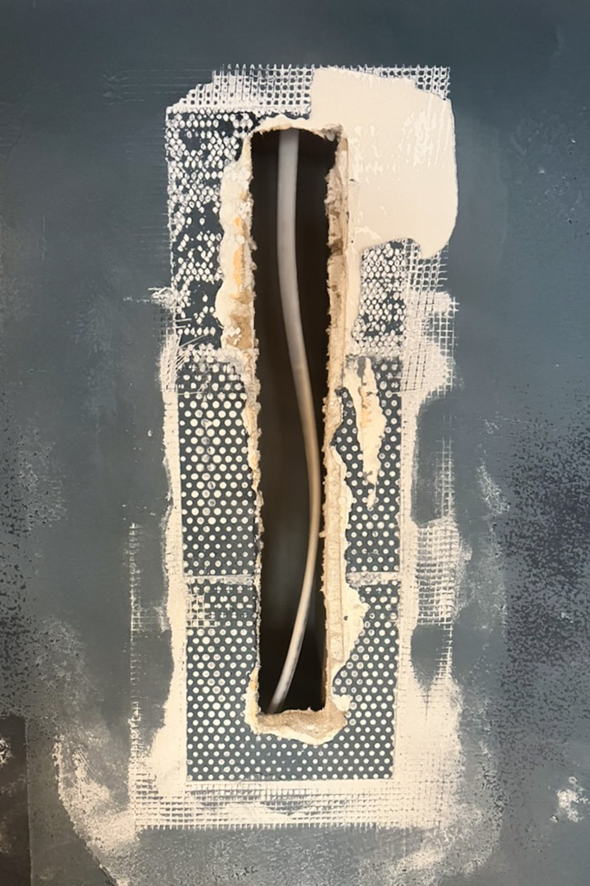
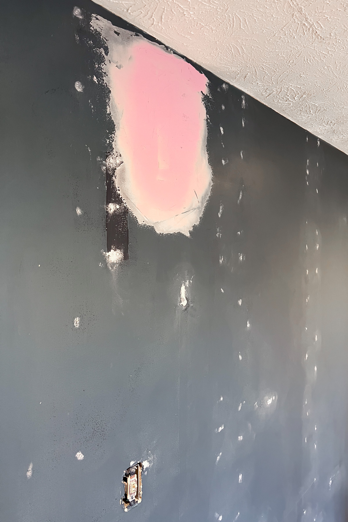
Next, we focused on the navy accent wall. After removing the batten molding, we faced countless nail holes and, more frustratingly, an extremely poorly executed patch job from a previous canned lighting installation. What began as a plan for a quick re-skim turned into a much bigger project. The only path forward was a full correction: removing the flawed patch, installing new drywall, and completely resurfacing the area to ensure a smooth, flawless finish.
Phase 2: the paint color saga
Determined to create a moody office, I initially believed selecting a deep, dramatic wall color was the key.
My first pick was Antiquing JG-128 from Magnolia Home, a rich taupe that initially seemed perfect. Paired with the new white trim, the contrast was striking and sophisticated. However, as time passed, the subtle purple undertones became impossible to ignore. I lived with it for months, trying to convince myself it worked, but the nagging doubt about the color and the challenge of decorating around a dark palette never faded.
After admitting defeat, I decided to go lighter. I sampled a few more colors:
- Ice Formations 973 (Benjamin Moore): A warm greige that’s stunning on our exterior, but felt too muddy inside.
- Swiss Coffee OC-45 (Benjamin Moore): The internet’s favorite creamy white, but it was too bright and threatened to start a full-house repainting spree. Absolutely not!
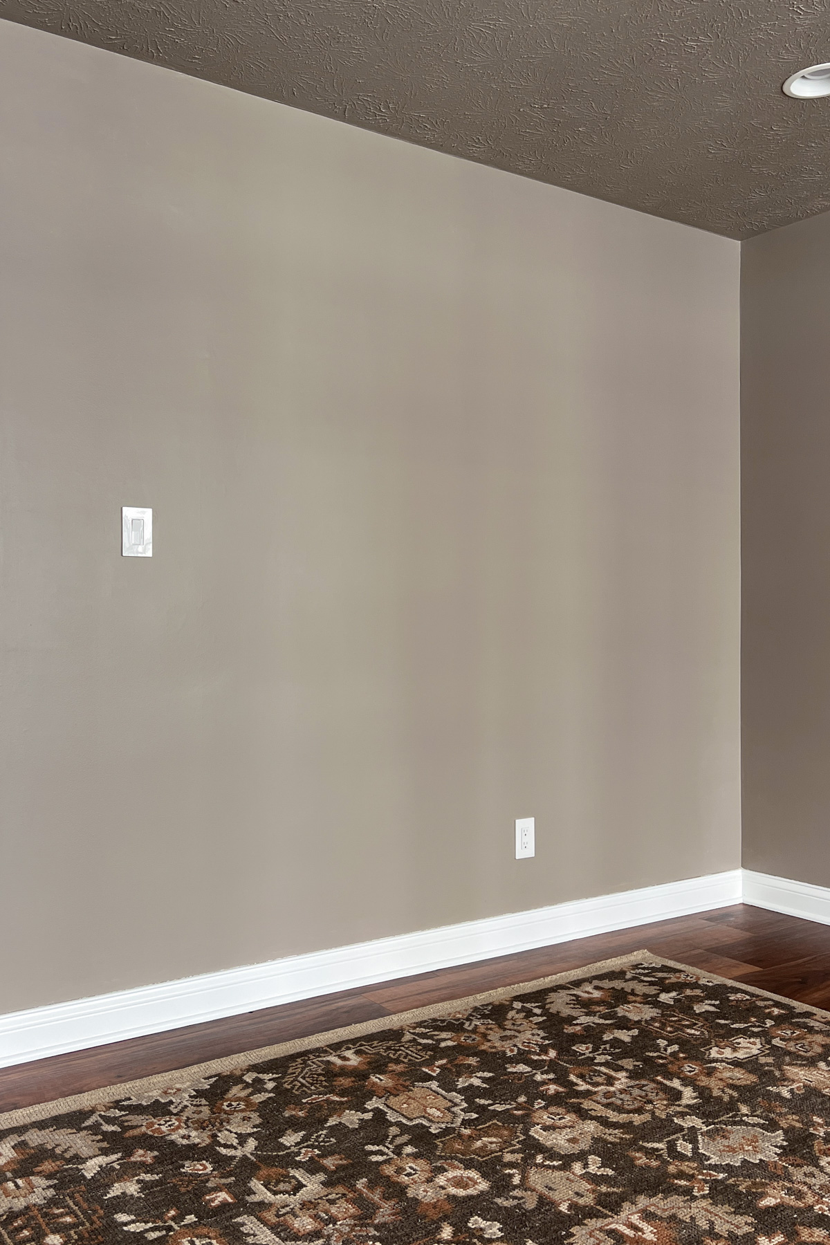
In the end, I chose simplicity and cohesion, landing on Benjamin Moore’s Calm OC-22. This soft, versatile neutral is the color used throughout the rest of the house, giving the office a serene, balanced backdrop. No more second-guessing, no more repainting. Looking back, embracing the soft neutral allowed the furniture and decor to truly shine.

Decorating and the final transformation
With the challenging prep and painting finally behind us, the real fun began: selecting furniture and decor to bring this space to life.
Anchoring the space
The room is grounded by key pieces that offer warmth and stability:
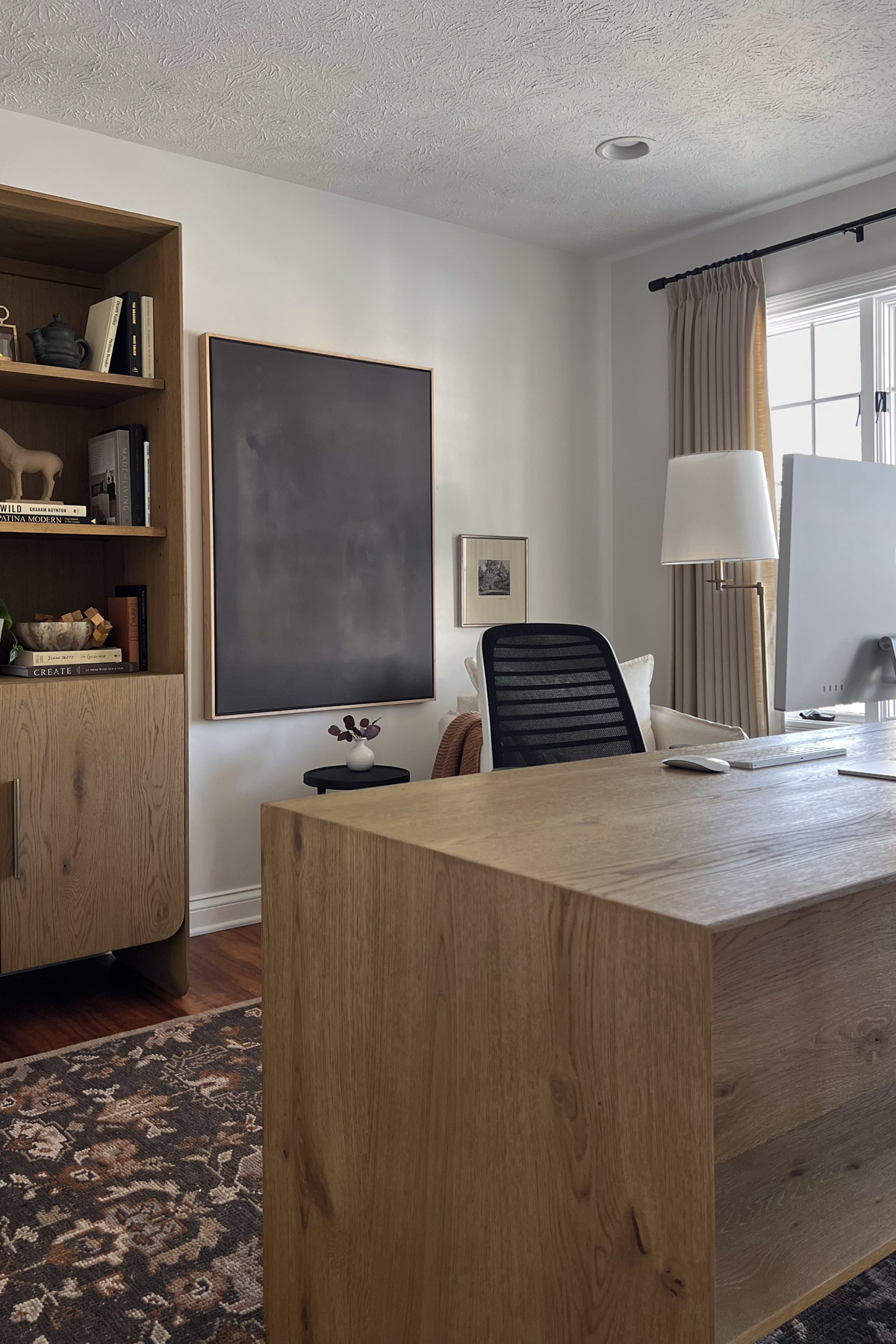
Area rug: I chose a large traditional wool rug with rich tones of espresso, rust, charcoal, and creamy beige, featuring an intricate pattern. This piece not only anchors the room but also infuses it with warmth, timeless texture, and an inviting sense of refinement. It delivers the same sense of drama I originally hoped to achieve through dark walls.
Desk and bookshelves: To balance the rug, I incorporated light wood tones. The main anchor is a large, contemporary waterfall-style desk in honey oak, defined by its thick, rectangular silhouette. Behind it, a tall matching bookcase offers open display shelving and closed cabinetry for practical storage.
Curating the bookshelf aesthetic
Bookshelves instantly infuse a space with personality and visual interest. I’m building the desired collected feel through intentional styling:
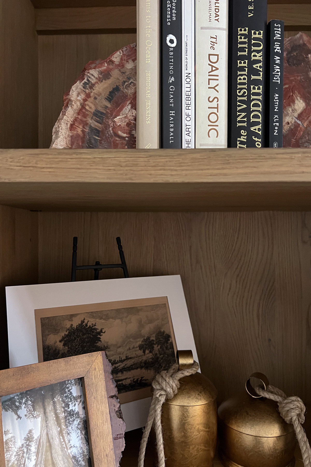
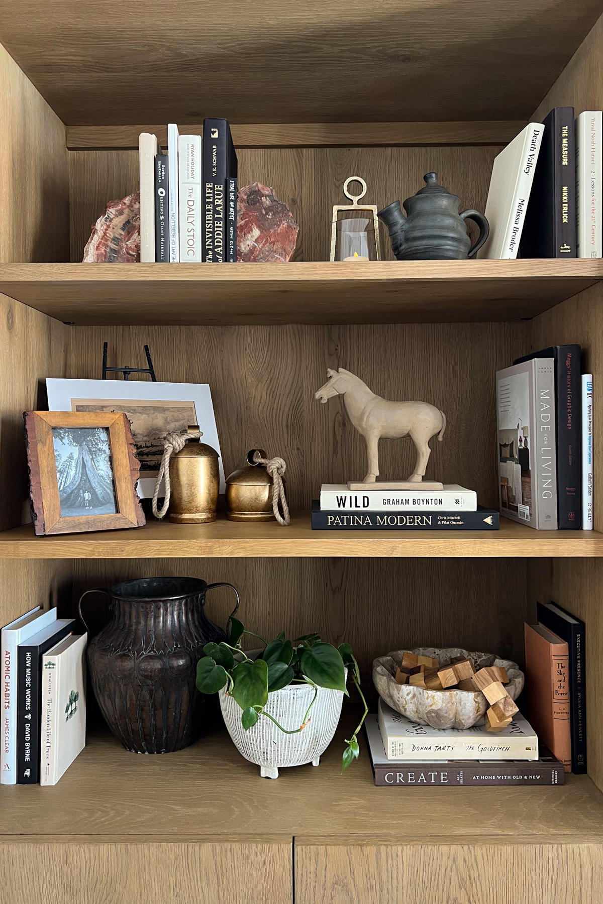
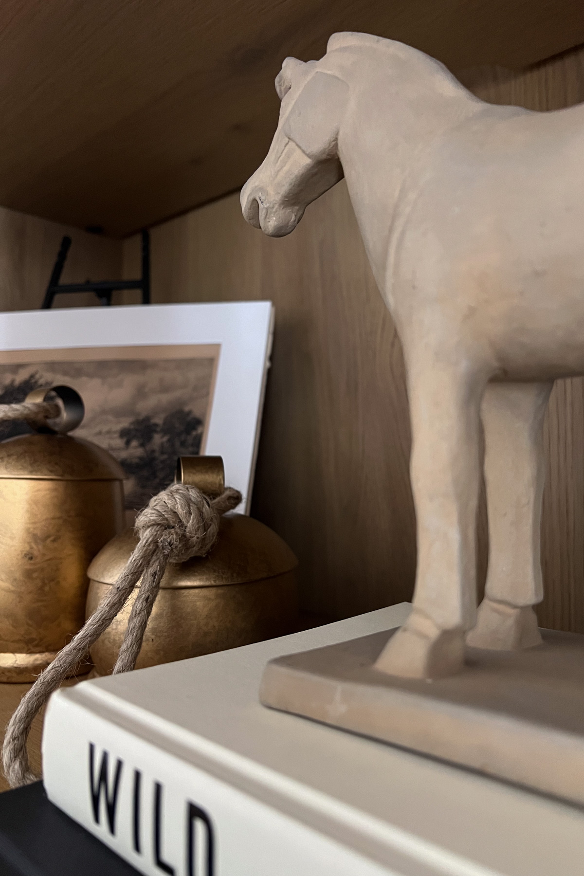
Anchoring with weight: I grounded the display with heavier pieces, including a vintage copper vase with an aged patina and hammered finish, as well as natural stone elements. These, paired with antique brass accents and wood pieces, create visual weight, depth, and a sense of permanence.
Adding organic texture: I brought in raw, natural elements such as petrified-wood bookends, a live-edge picture frame, sculptural wood-block puzzle, a green plant, and a clay horse discovered at an antique shop.
Curating the book collection: I focused on books I genuinely love, choosing ones with beautiful spines, interesting typography, and neutral covers, avoiding anything too bright to ensure the collection felt both authentic and organically integrated into the color palette.
Art, light, and a cozy nook
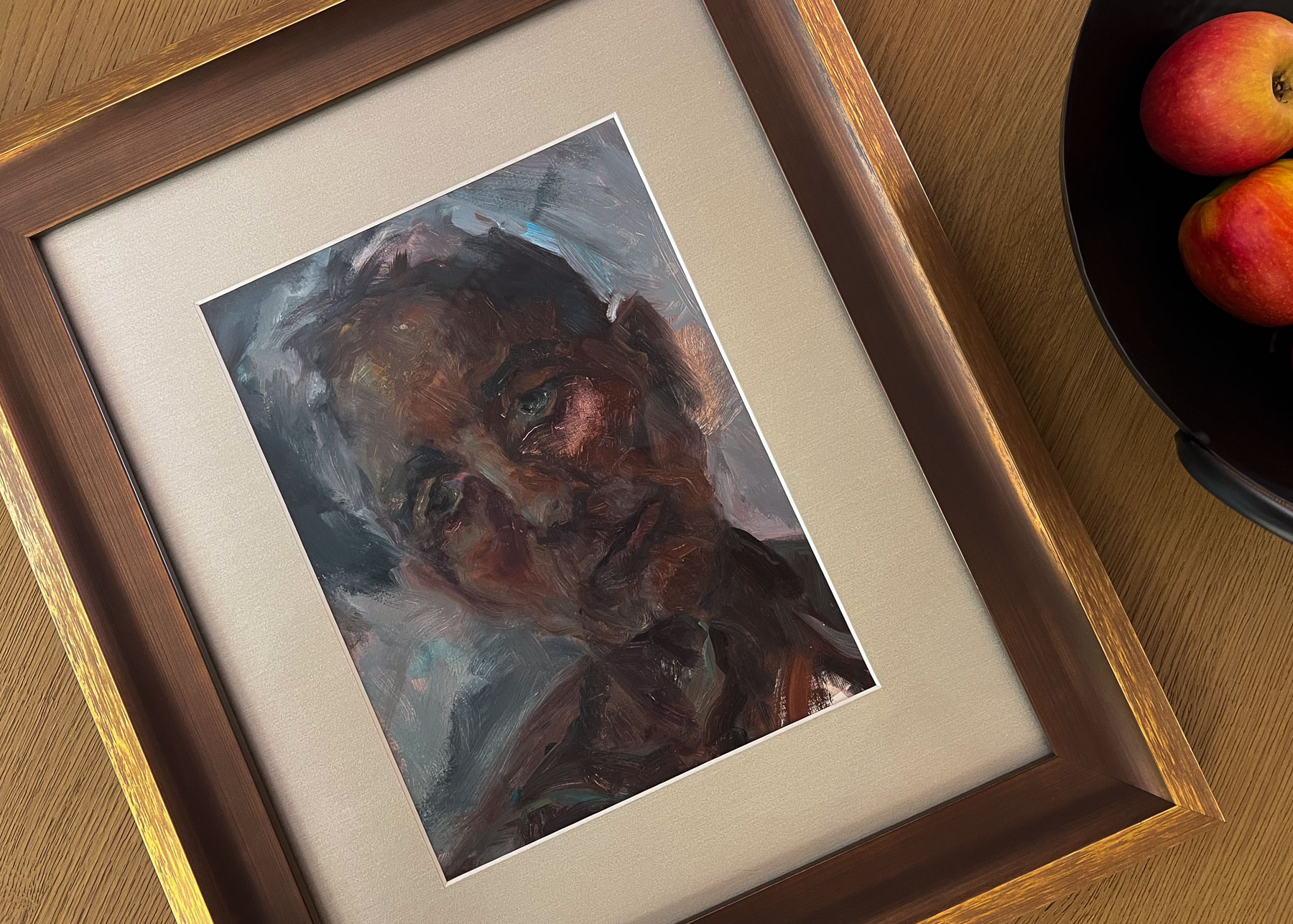
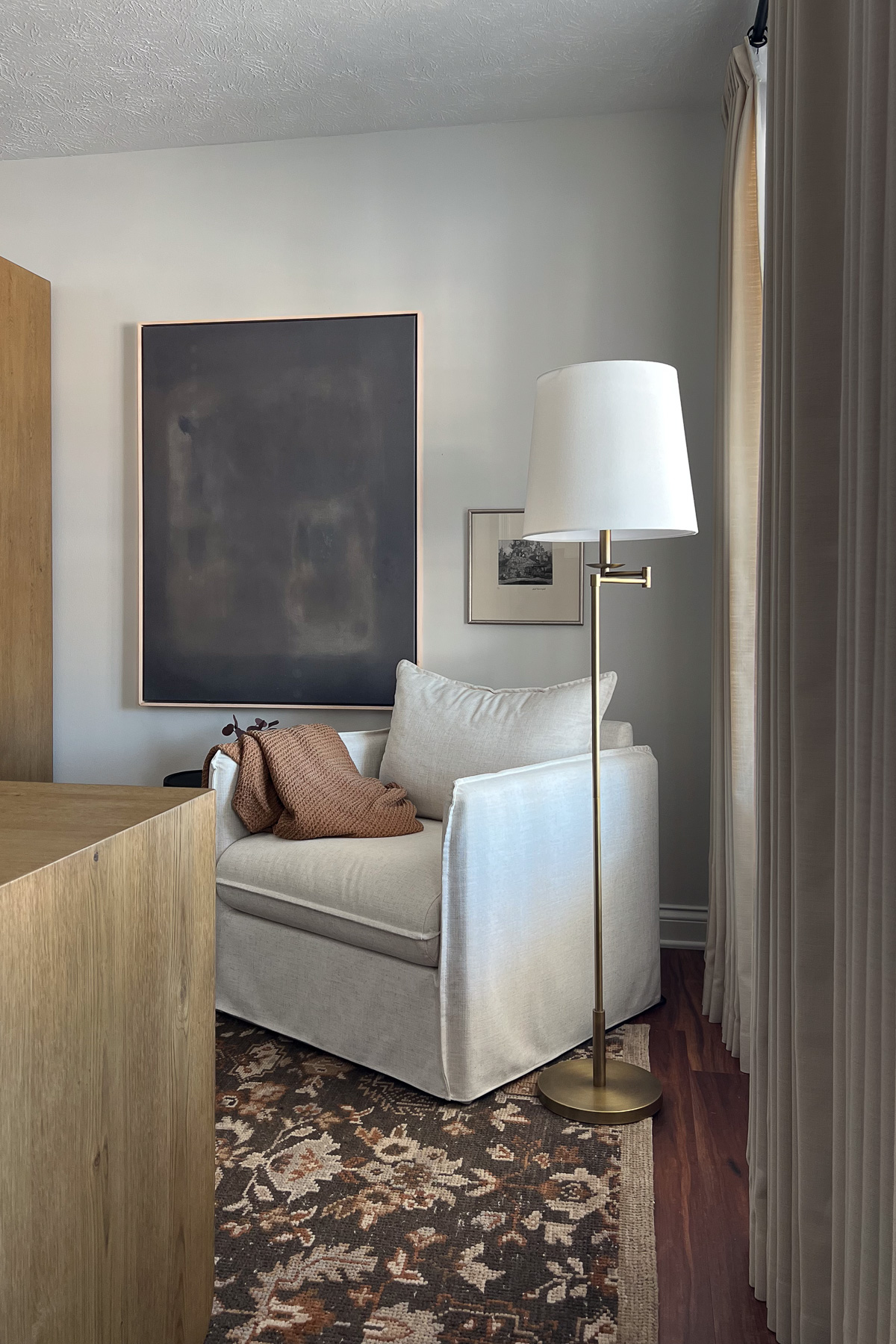
Wall Art: As a lover of abstract, melancholic work, I mounted Jordan Nichole’s Into the Unknown behind the desk. This piece adds a much-needed pop of color and contrasts the light walls and wood.
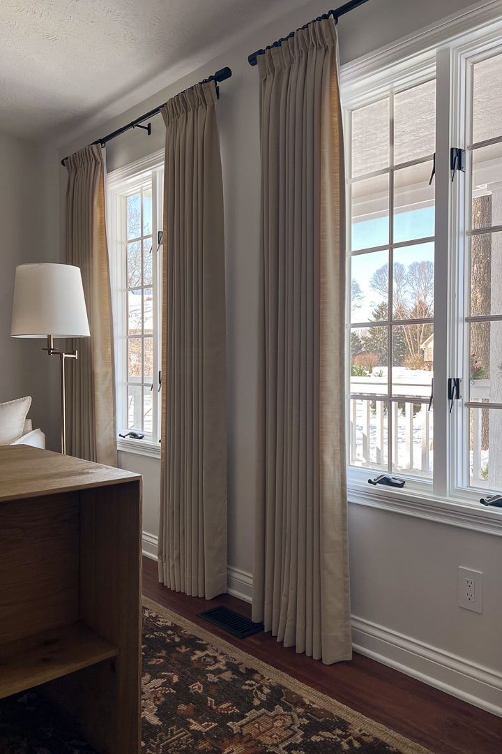
Window Treatments: Full-length, tailored drapery panels in heavyweight linen instantly elevated the space. Hung high and wide in a creamy beige, their substantial fabric accentuates the windows, adding a sense of luxury and coziness.
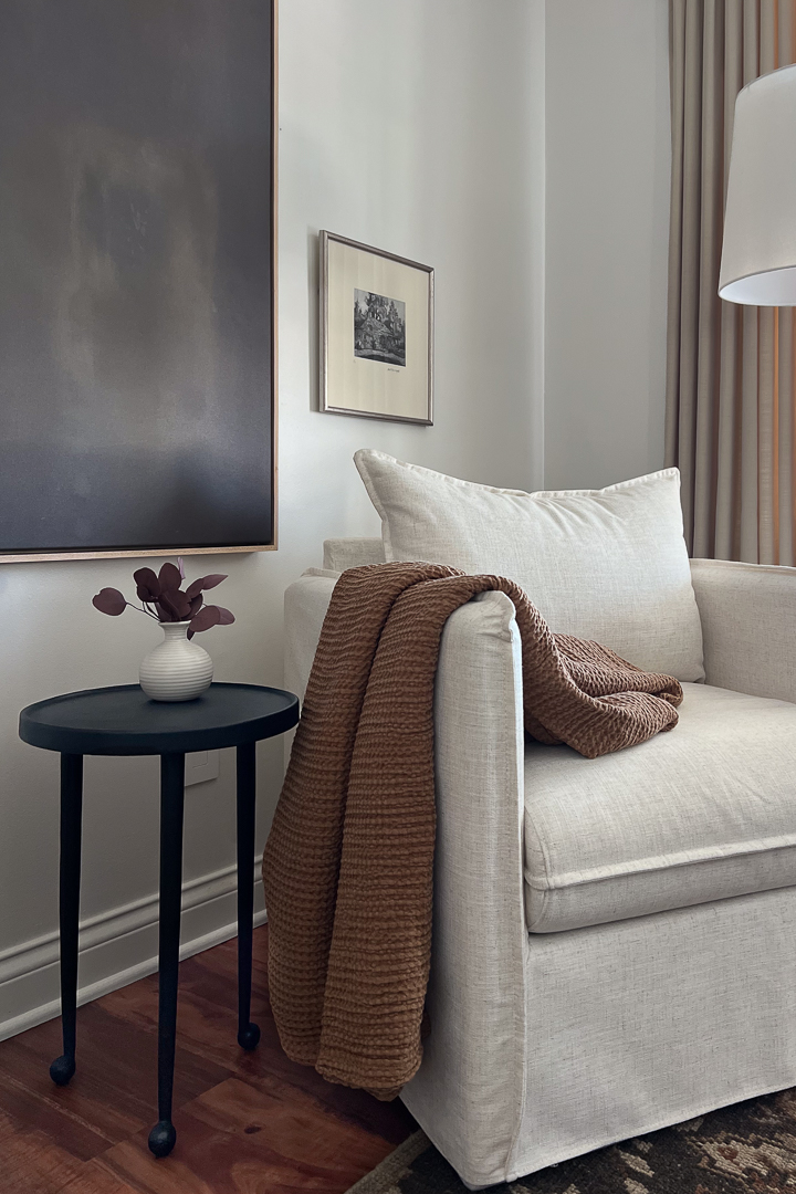
Seating area: I created a welcoming corner by the window for reading and relaxing:
- Chair: A pillowy, slipcover off-white armchair introduces softness and warmth.
- Lighting: A simple, aged brass-and-white linen floor lamp casts a gentle, relaxing glow. We also added dimmers to the canned lighting. This is one of the simplest and most effective ways to enhance the atmosphere. The ability to shift the light from bright and energizing to soft and tranquil at any moment provides ultimate flexibility for the room’s ambiance.
- Side table: A small, round black side table with charming ball feet adds a subtle old-world touch and a bit of whimsy character. Its matte, slightly pitted texture prevents the corner from fading into pale tones.

This transformation was more than a fresh coat of paint and new furniture. It was a journey of unexpected challenges and careful choices designed to create a space that feels like home. By layering textures, colors, and meaningful pieces, this room no longer feels dated and is a personal and inspiring office I get to enjoy every day. I hope this before-and-after inspires you to embrace the process, knowing that every detail brings you closer to a space that reflects who you are.
Up next